Welcome to the Subscriber’s Salon!
This private page is reserved exclusively for my email subscribers. Here, you receive an advance look at new paintings before they are exhibited publicly or older paintings offered for a second look—along with the opportunity to acquire them at 15% below gallery price for a limited time.
The painting below is available to subscribers through July 31, 2026.
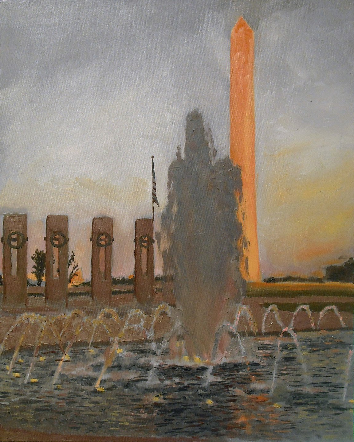
Washington Nocturne
Blue’s Illusion
Washington Nocturne is an 16 × 20 inch oil on canvas painting, unframed
Gallery price: $325
Subscriber price: $280—available through July 31, 2026
Once upon a time, blue was a very expensive pigment in the world of oil paints. During the Renaissance, blue pigment was made from the crushed precious stones of lapis lazuli found in the mines of Afghanistan, and more expensive than gold until synthetic substitutes came along.
Artists came up with tricks to create the illusion of blue using the visual phenomenon of simultaneous contrast. By placing neutral grays near more vibrant, warm complementary colors like orange and yellow, the eye reads the gray as blue because of how the visual cortex shifts perception based on surrounding color.
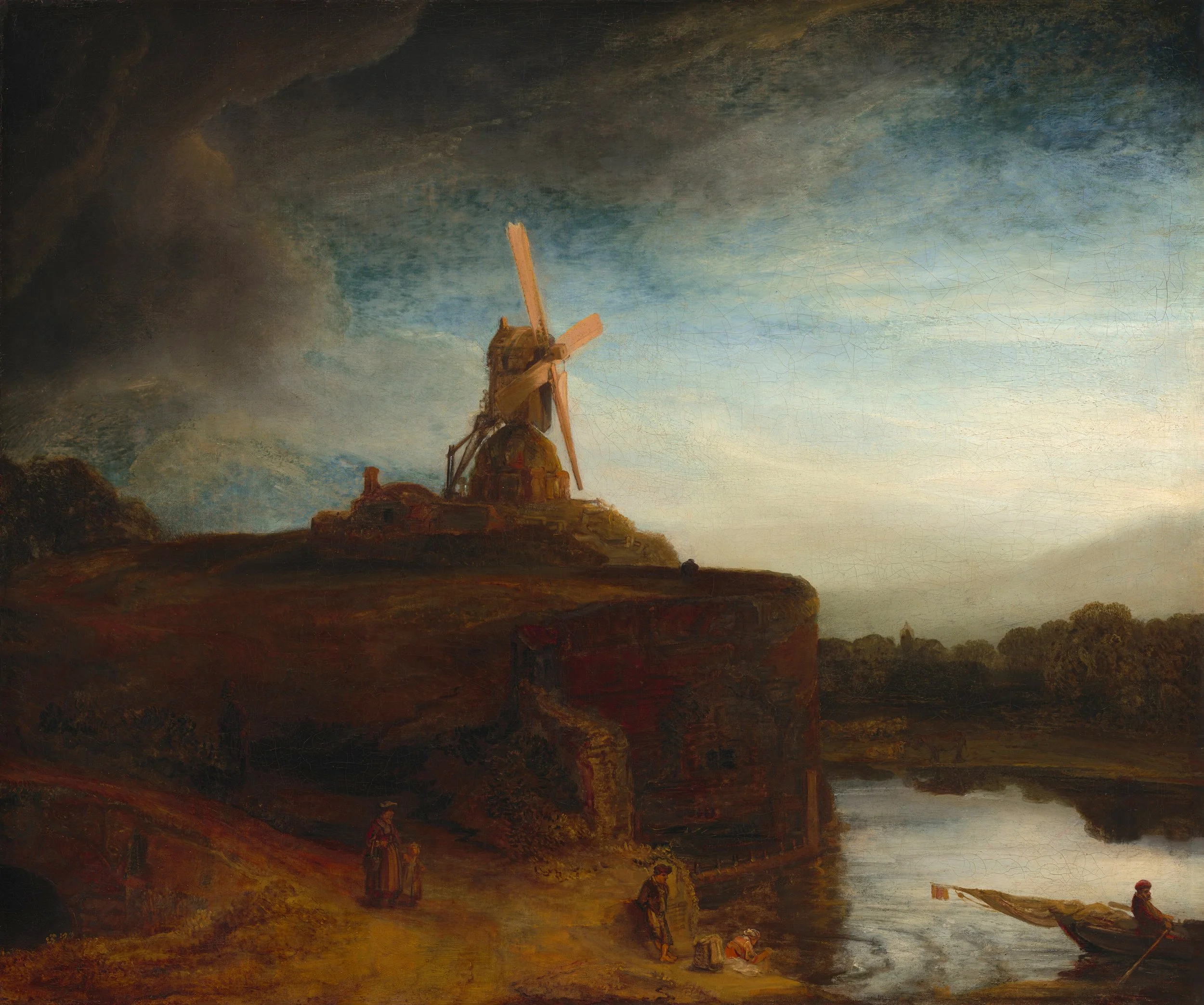
Rembrandt van Rijn’s painting The Mill from around 1648 shows how warm and vibrant colors use simultaneous contrast to create the effect of a blue sky.
The Swedish painter Anders Zorn (1860–1920) built an entire career on a limited palette that excluded blue altogether, achieving luminosity through exactly this kind of perceptual sleight of hand. For an assignment in one of my painting classes, we used this limited palette to experiment with simultaneous contrast.
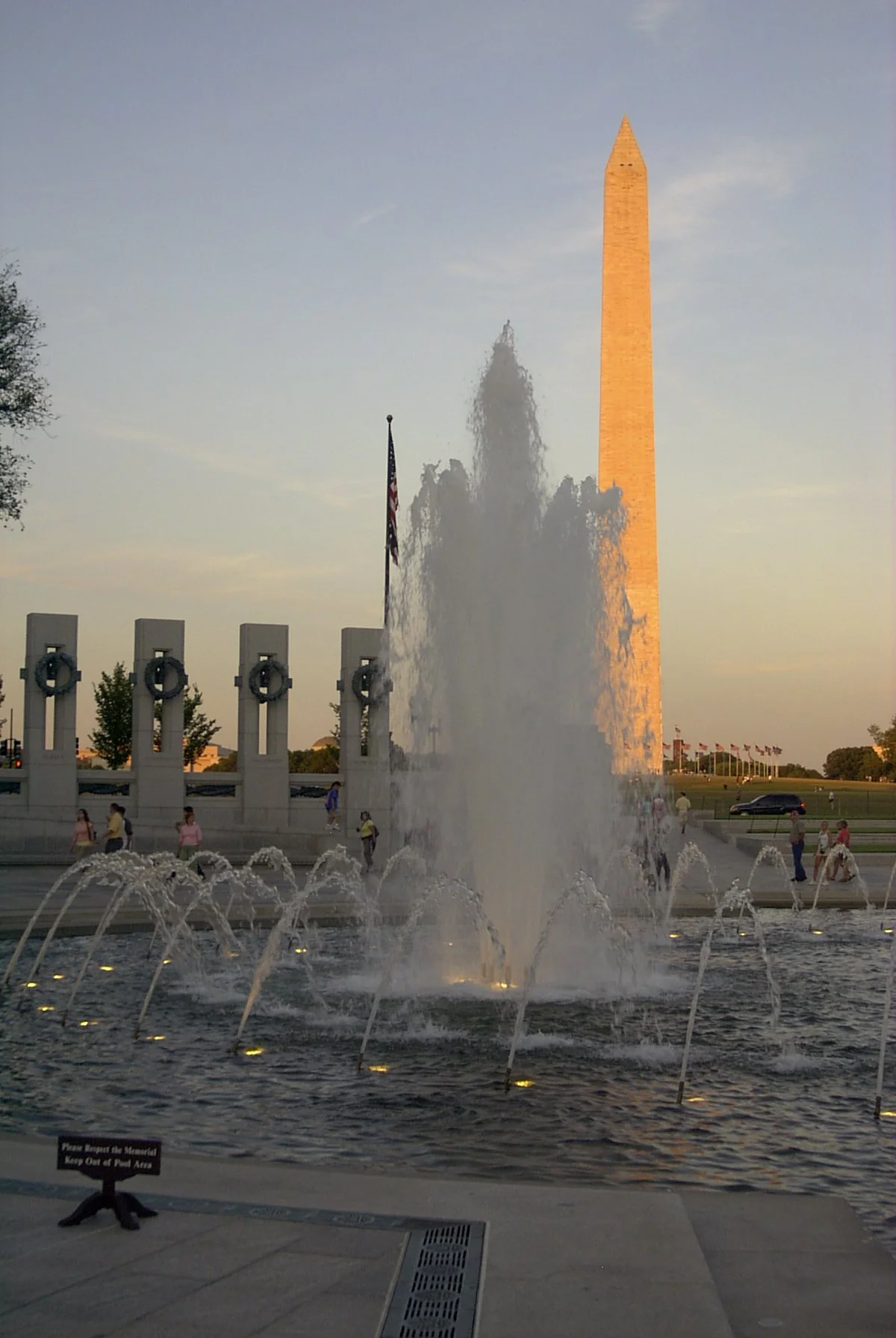
The reference photo here came from a visit to the Mall with my father, a Navy veteran, when the WWII Memorial was still relatively new. We arrived near sunset, and the late light did exactly what I needed: long, warm oranges and yellows that would let me build the blue illusion without a single touch of blue.
The brushwork in the painting is looser than my current style. I was in an Impressionist phase at the time. I’ve thought about doing a second version with a more controlled hand and actual blue on the palette. But the experiment is baked into this one, and I don’t want to lose that.
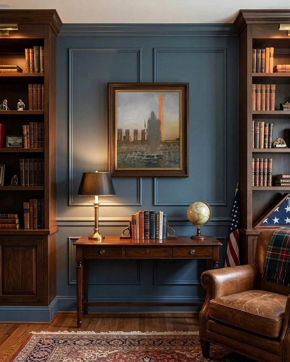
What you see as blue in this painting isn’t blue. It’s gray placed carefully next to warmth until your eye does the rest. For someone who wants a painting that rewards a second look and serves as a conversation piece to tell guests about, this one earns its place on the wall.
If this painting resonates with you, contact me before August 1, 2026 to reserve it at the subscriber price. As always, once you acquire a painting, you receive a permanent 15% discount on future purchases. Please note: For collectors outside San Diego, shipping is additional.